Building One Markdown Blog for Two Interfaces
How this site uses Nuxt Content to publish one Markdown archive through a Windows 95 browser and a modern publication without splitting URLs, metadata, or search authority.
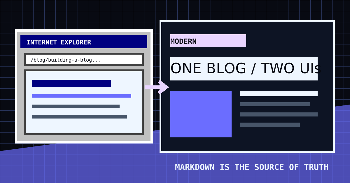
I've been thinking for a while now that it was probably time to add a blog to my home page. I keep learning things while experimenting with LLMs, self-hosting, infrastructure, security, and whatever else has my attention that week, but most of those notes end up scattered across files, different machines, or in my own memory. This blog page will give them somewhere better to live.
This will be a place to document what I am learning, record progress, share useful findings, and occasionally write about something simply because it piqued my interest. Some posts will be technical, while others maybe not but that is the point. It is a place where I will share more of myself with whoever happens to be reading.
Writing things down can also give someone else a chance to find an answer that took me time to figure out. A lot of what I know started with another person's blog post, a forum thread, or a Reddit question that happened to describe the exact problem I was dealing with. Publishing my own notes is a way to contribute back to that very informal body of shared knowledge that is the internet.
Adding a blog to my two-interface site raised a structural question: how do we publish one body of writing through two very different UIs without creating two separate blogs?
The answer is a shared Markdown content system, canonical URLs, and theme-specific components.
The starting inspiration came from the Markdown-driven blog system in the FAIR Data Innovations Hub website repository, the non-profit I work for. I liked the basic idea of writing blog posts in Markdown, building the blog presentation around them and then adapating that approach to this site's two-interface setup.
Markdown as the source of truth
It starts off with posts living in content/blog/ as Markdown files. Each file contains frontmatter for information that is used outside the article body:
---
title: Building One Markdown Blog for Two Interfaces
description: A concise summary for cards, feeds, and search results.
publishedAt: 2026-06-23
author: Dorian Portillo
tags:
  - nuxt
  - design systems
thumbnail: /blog/dual-interface-blog.svg
thumbnailAlt: A description of the thumbnail
draft: false
---
Nuxt Content parses the Markdown and validates this metadata against a schema. Internally, Nuxt Content builds a SQLite index so the application can sort posts, filter tags, find related writing, and generate feeds. SQLite is not the source of truth and there is no hosted database to maintain. The generated index can always be rebuilt from the Markdown files.
This keeps writing close to the repository while avoiding the friction of storing long articles inside Vue components.
One URL, two presentations
Both interfaces use the same canonical routes:
/blogis the blog home page./blog/:slugis a blog post./rss.xmlis the feed. RSS (Really Simple Syndication) is a standard format that lets readers subscribe to a site and receive new posts automatically without visiting the site directly. The XML opens in the browser so it can be inspected or copied, while still being usable by feed readers and aggregators.
The saved UI mode determines how a route is presented. It does not change the route itself.
In Windows mode, the route is rendered inside a retro browser like the one I used as a kid to visit cartoonnetwork.com or addictinggames.com and play Flash games (the simpler days before the commodization of the web).
The browser has local Back, Forward, Home, Refresh, and address controls. Its address bar accepts blog-local paths but is not a general purpose browser as that could bring some security concerns. Figuring out every edge case would have practically meant building a mini browser inside a web app, which sounds horrible to maintain lol.
In the modern UI, the same post becomes a full page over the existing particle system. The typography, motion, panels, and colors had to be built for that interface but the article data and URL are identical.
If the site had /windows/blog/post and /modern/blog/post, it would create double the work, the url would include /windows/or /modern/ (which I find ugly), search engines would see duplicate pages and inbound links could split authority between them. A single canonical route concentrates those signals and gives every post one permanent address.
Separating content from presentation
The implementation has three layers:
- Content: Markdown and validated frontmatter.
- Shared behavior: queries, dates, reading time, tag filtering, related posts, and article navigation.
- Presentation: Windows browser and modern components with independent responsive rules.
The article renderer does not know what stylized component is being rendered inside while the outer theme supplies the visual language.
This separation prevents the two interfaces from drifting into different content models. It also makes a future third reader possible without migrating the archive.
The state problem hidden in route navigation
The first implementation exposed a subtle desktop problem. Window state lived in local Vue refs inside the Windows desktop component. Opening the blog navigated to a new Nuxt route, which unmounted the desktop. Returning home constructed a fresh desktop and reopened only its default windows.
That behavior broke the illusion and made returning from the blog annoying. A user could leave Explorer, Spotify, or a portfolio document open and find the entire arrangement erased after reading a post.
The application state now uses Nuxt's useState storage. It survives client-side route changes while remaining scoped to the visitor's current application session. Open applications keep their position and resized dimensions as well as their open or closed state. The active application and selected Notepad document are preserved too, and the blog browser maintains its own window geometry. Transient controls such as the Start menu remain local because reopening those would be surprising.
It is still not a perfectly seamless desktop. A full page reload starts a new window session, dragged desktop-icon positions are not saved, and temporary UI such as the Start menu closes during navigation. The blog is also rendered as its own desktop-like scene instead of opening as another window on top of the home desktop. Each of those boundaries can briefly expose the fact that this is still a website acting like an operating system.
The blog is a separate page, so the home page's desktop icons do not follow it. That is intentional. When someone leaves the blog and returns home, their previous desktop arrangement is restored instead of being recreated inside the blog page.
There is a broader lesson here: visual metaphors create behavioral promises. Once a website presents the illusion of a desktop, users (or I) expect the desktop to behave like a desktop. Navigation had to respect this expectation by maintaining the state of open windows and applications, rather than resetting them with each route change.
Responsive design across screen sizes
The desktop browser is draggable and windowed on larger screens. On mobile it becomes a stable, nearly full-viewport reader above the taskbar. Toolbar controls become horizontally scrollable, the address field remains usable, and post cards collapse into a single column.
The modern archive uses a symmetrical two-column grid on wide screens, with cards aligned evenly across rows and columns. Mobile collapses the grid, reduces display typography, stacks adjacent-post navigation, and keeps controls large enough for touch. The scrolling topic line comes first, followed by a persistent Back home link on both the archive and individual entries. On an entry, it sits directly above Back to blog listing without adding a full navigation section.
Both views render the same semantic heading structure. Responsive design changes composition, not document meaning.
Search engine optimization for the blog
Visual novelty cannot replace discoverability. Each post supplies the information search engines need to understand and present it:
- a unique title and description
- one canonical URL
- publication and modification dates
- Open Graph and social preview images
- article tags
BlogPostingstructured data- descriptive image alternative text
- an RSS feed and XML sitemap
- semantic headings and server-rendered article content
The site also exposes author identity links in structured data. That helps connect the writing to the same person represented by the portfolio, GitHub profile, and professional accounts.
Technical SEO only makes a page eligible to be understood. The useful part still has to come from the writing itself. For me, that means answering specific questions, using descriptive titles, linking to primary sources, connecting related posts, and sharing what I actually learned instead of repeating a generic summary.
What about AI and LLM optimization?
It is tempting to add a hidden prompt telling AI scrapers how to describe or rank the site. That is not a reliable strategy. Crawlers may ignore it, treat it as manipulation, strip it during extraction, or expose the hidden instruction as part of the indexed content.
AI-oriented discoverability should use the same qualities that make a document useful to people and search engines:
- clear factual summaries near the beginning
- descriptive headings that stand on their own
- explicit relationships between the author, project, and source code
- stable URLs and dates
- machine-readable structured data
- an accessible RSS feed and sitemap
- concise public guidance in
llms.txt
The site's llms.txt file describes the available material and points agents toward canonical sources. It is a navigation aid, not a command to give the site preferential treatment.
No file can guarantee inclusion in an AI answer. The durable strategy is to publish original work with enough context that a person or machine can cite it accurately.
Tradeoffs of the system
The shared architecture avoids duplicated content, but it does not remove the extra design work. I still have to design and maintain multiple components for the same blog posts and more broadly for the entire web app.
I keep both interfaces because I genuinely enjoy the old Windows 95 style and I also wanted to challenge myself to build a UI that is loud while still making it feel modern and usable. Getting both versions to feel good without compromising either one has introduced its own set of challenges, but that's a topic for another blog post ;)
Every new blog feature must work in two visual systems. Code blocks use dark syntax colors in the modern reader and a light editor-like treatment in Windows 95. Navigation has to update the real route and the simulated address bar. Theme persistence must work during server rendering. Desktop state, including window geometry, must survive when the desktop is temporarily unmounted. The RSS route renders as inline XML so it can be viewed and copied without triggering a download.
Testing also multiplies. Each post route needs desktop and mobile coverage in both themes, plus metadata and feed verification outside either interface.
The advantage is that these constraints force a cleaner boundary between content, behavior, and presentation. The blog is not two sites pretending to agree. It is one archive with two honest interpretations.
const blogSystem = {
  source: 'Markdown',
  routes: 'canonical',
  presentations: ['windows95', 'modern'],
  priority: 'write once, render with intent'
}